Technical management of a wind asset is a tedious work which requires not only to supervise the wind asset production, but also to analyze the turbine performances in order to detect if the turbine is under or over performing.
Data analysis is key when managing a wind asset. By transforming data into insight, into information, asset manager and owners are provided with a set of information useful to challenge the turbine manufacturer.
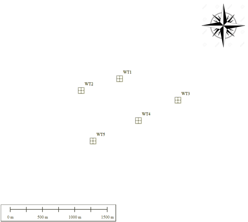
We will illustrate this article with a specific example, as shown on the below layout and more particularly on WTG1, WTG2 and WTG3.
When strictly analyzing the power curves of the three wind turbines, WTG3 seems to underperform compared to other turbines :
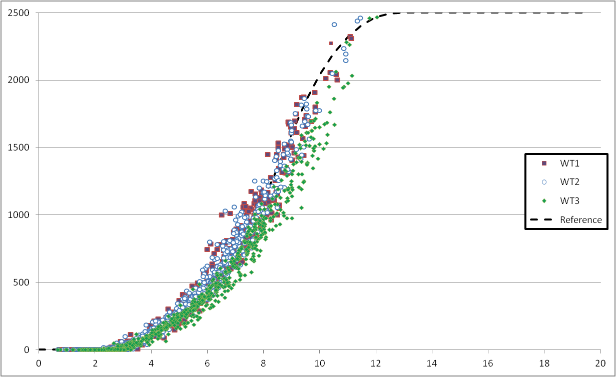
Though, after further analysis, it has been found that the relative underperformance is actually due to the transfer function of the corresponding nacelle anemometer. Only analyzing the power curve via the traditional graph, is therefore not sufficient to understand theturbine performance.
This note aims to provide some keys to understand turbine behavior and detect possible underperformance.
Which analysis are to be taken into account?
Ratio
To avoid the impact of nacelle anemometer measurements, we recommended to work directly with production data.
First performance indicator is the ratio R as described in the below formula. The ratio is the difference between the wind turbine to analyse and the average production over the whole wind farm, on the same period:
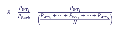
Where
PWTi is the production of the ith wind turbine
N is the number of wind turbines
When a reliable pre-construction yield assessment is available, the aforementioned ratio can be calculated for each turbine and used as reference. Two parameters are taken into account to estimate the reliability of the pre-construction ratio:
- Wind flow modeling: errors in wind variations increase with the terrain complexity.
- Wake modeling: when the layout does not respect the recommended inter-turbine spacing, corresponding input conditions are outside of the validation envelope, leading to biased results in some cases.
The table below shows the calculated ratios during pre-construction and during various operational stages:
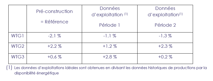
Period 1 = November 2016
Period 2 = January 2016 to November 2016
By calculating this parameter each month, any abnormal events, compared to expectations (pre-construction), will be noticeable. A difference of more than 5% will needto be further investigated . as it can be due to a change in the wind distribution or an issue with the turbine performance.
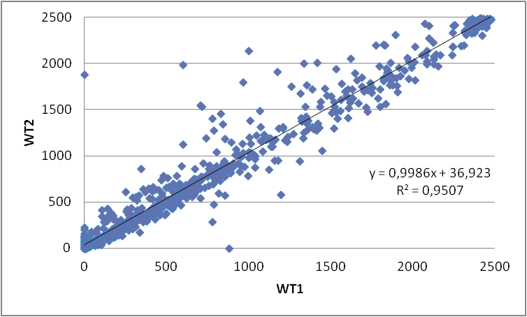
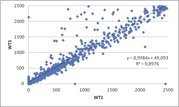
Scatter plot
Another useful tool is the scatter plot. By plotting a time series of production data, measured at a wind turbine considered as reference (WTG1) against another series of production data, enables to highlight discrepancies.
In the example below, production data were plotted for November 2016.
These graphs not only show the general consistency in the production between all turbines but also the outliers. In this particular case, WTG1 and WTG2 have similar trends. More discrepancies are observed between WTG1 and WTG3 due to different exposure to wake effects (see the layout).
In any case, no major underperformance has been observed in November 2016.
CONCLUSION : data is key to understand wind farm performance
By analyzing other indicators, and provided that terrain is simple and layout respects inter-distance (to limit wake effects), we can come to conclusion that WTG3 is performing at its optimum levels and like other ones of the same park, on the studied period of time. Data analysis is therefore key to understand operational wind farm performances.